Context
The Pipette Claims App is a client support tool that allows users to claim instruments so our team can inform them of upcoming calibrations. Pipettes require regular calibration in order to ensure accurate results in experiments.
As Pipette Coordinator at Thermo Fisher Scientific, we needed to reconcile our inventory of 1200 pipettes with their users, which could be any one of 400 different researchers. I previously attempted this through email but found that people were unlikely to respond and required a lot of work from both the pipette owners and I.
Rapid Designing
- Multiple Methods. Users needed to be able to claim pipettes in as many ways as possible.
- Easy Access. Accessible by anyone within the company, with no permissions requests.
- Contact Info Required. User's email and name must be saved with every submission.
- Quick Build. I was on a tight timeline, so this needed to be built and in users' hands in 1 month.
Experimenting with a New Tool
Based on these considerations, I decided to use Microsoft PowerApps, a low-code, rapid development environment. PowerApps would allow me to quickly build out the app with all of the features that I needed.
There was only one problem: I had never built anything with PowerApps before.
There was only one problem: I had never built anything with PowerApps before.
Building a Prototype Quickly
With little PowerApps experience, I needed to get to building as quickly as possible – the best design in the world would be useless if it was outside the capabilities of PowerApps. Because of this, early designs were extremely conservative. I focused on designs I assumed could be done based on my limited previous knowledge. Even then, I wasn't fully confident that it could be done.
Building the App
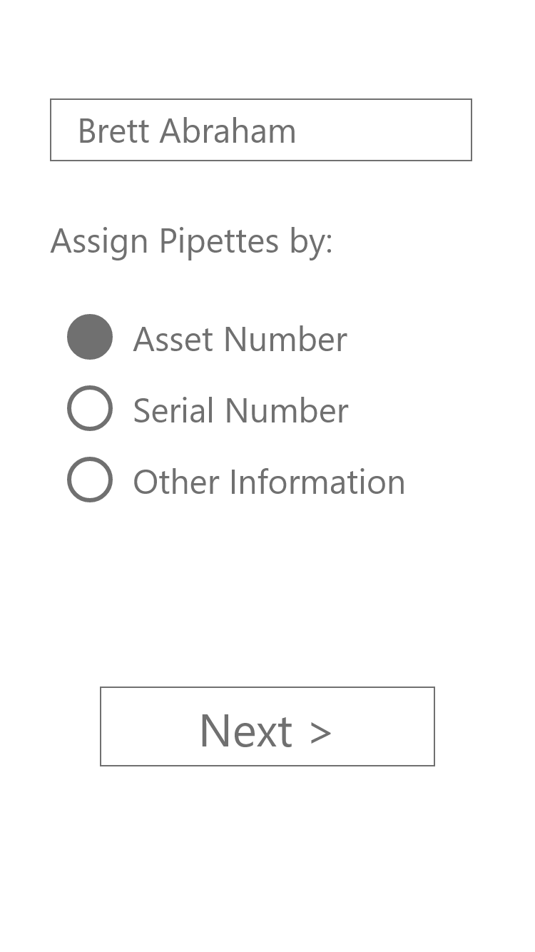
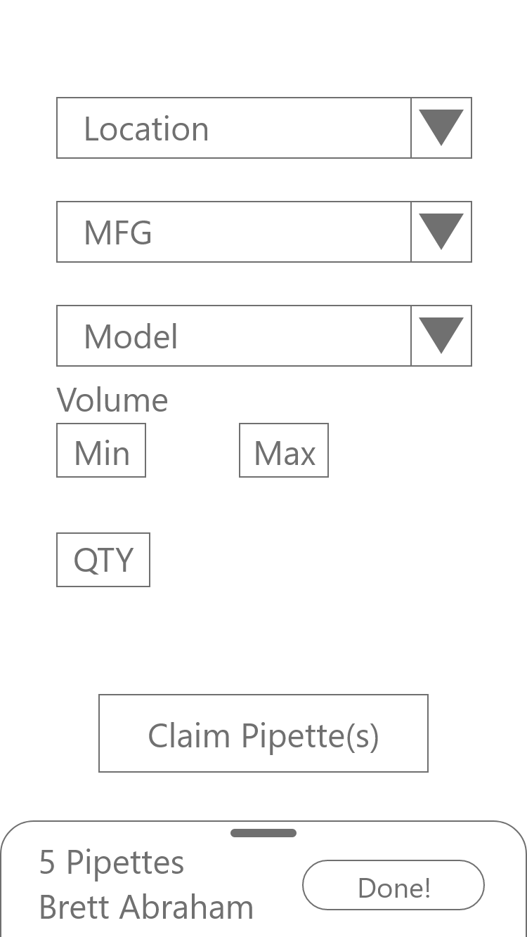
Building the initial design was easy. I included 3 methods to lookup pipettes:
- Asset Number (our unique ID)
- Serial Number (manufacturer's unique ID)
- Location (Room number and bench number)
The Pages
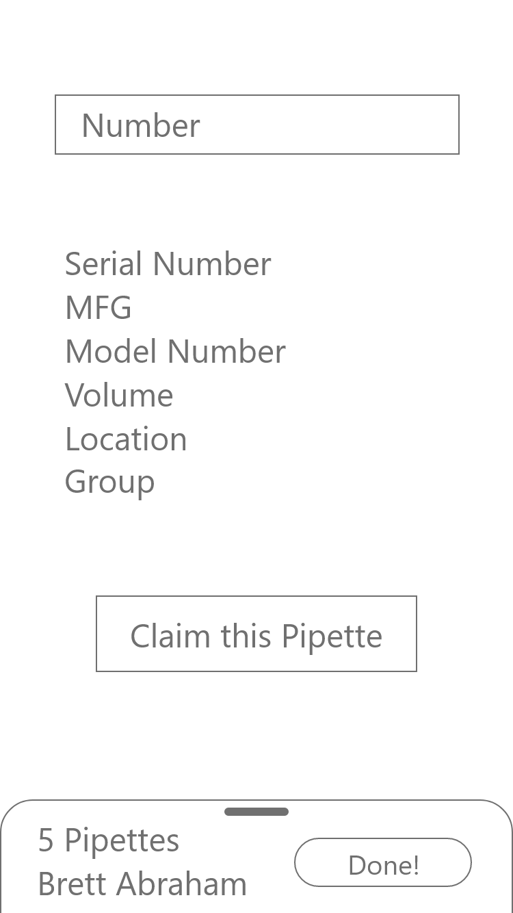
Since asset and serial number would be near identical screens, I opted to build it only once. Users would toggle between serial and asset number, and it would only appear to be a different page. Functionally, it's the same exact page.
When users toggled between the two, the only things to change were some text and the way it reported. I did this to streamline any updates I made, ensuring I only needed to make changes on one page.
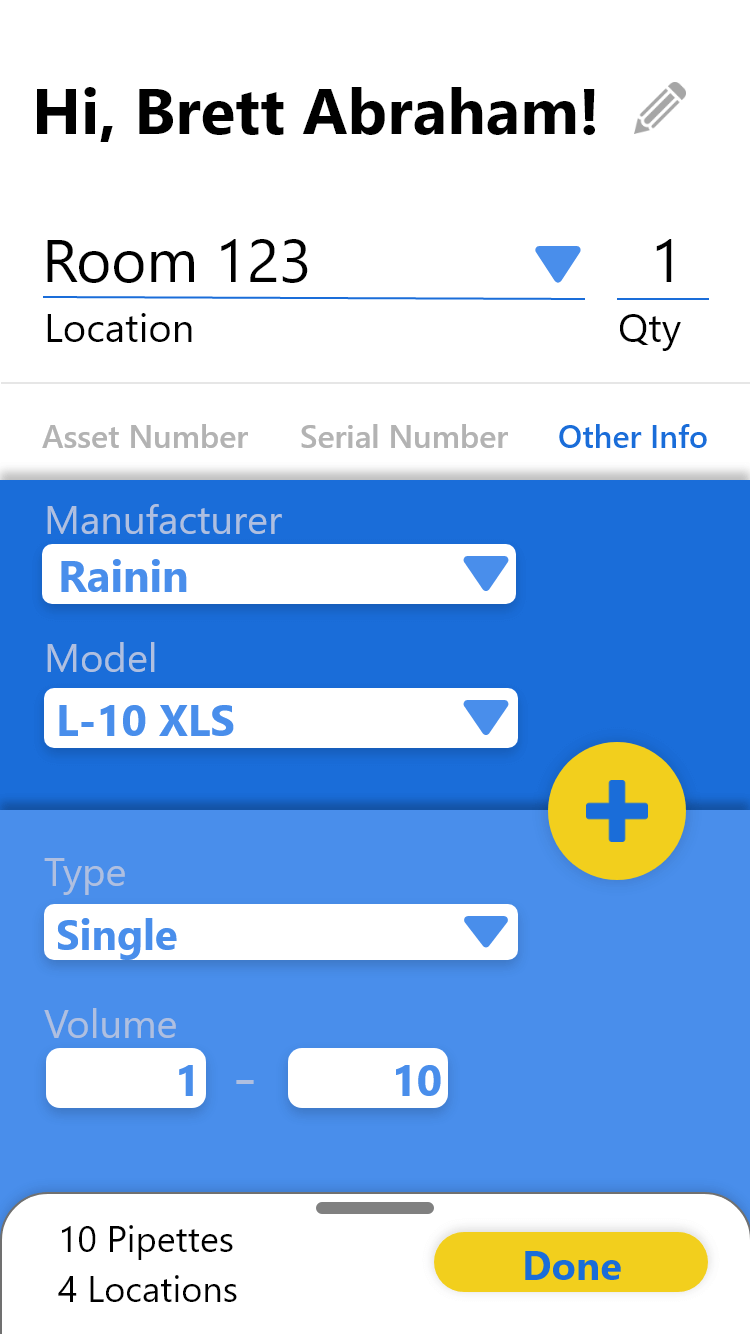
Location lookup worked differently. Rather than looking up specific pipettes, users would simply claim a certain number of pipettes at a location. Our team would then review the pipettes at that location to determine which belonged to whom.
The Database
For our dataset, I used an Excel Online workbook. It acted as a very basic database with everything I needed while allowing access to everyone within the company. One worksheet held the current pipette inventory while another held all submissions.
Within a few days, the basic tool was fully functional... but it was quite ugly.
The basic tool was fully functional... but it was quite ugly.
Make it Pretty
After some quick user tests, I defined a few key goals for the next phase:
- Easy Onboarding. Every PowerApps tool I had previously used required training prior to use. I didn't have that luxury – it needed to explain itself.
- Responsive Controls. Signifiers and feedback were key. People needed to know what they could do and what happened when they did it.
- Attractive UI. This was a client-facing tool. The app needed to not only be user-friendly but also user appealing.
Initial Improvements
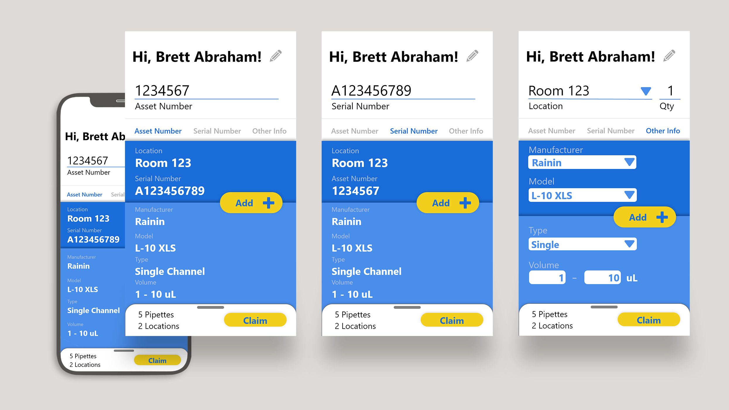
- Remove the Home Page. All the Home page did was get the user's name and email. This was now prefilled by the app, as anyone in the company needed to be signed in to use it.
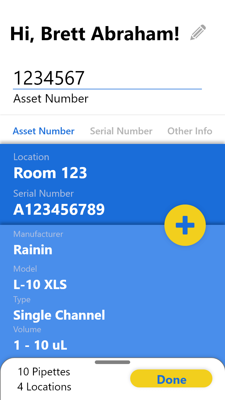
- Turn Lookup Pages into Tabs. After testing, it became clear that separating the lookup methods out so strictly would cause friction for users. Allowing users to quickly swap between each method would greatly simplify their experience.
- Add Color. I used the company colors, using the 60-30-10 rule (albeit a bit modified).
- Improve Layout. I created a layered card design to better highlight the most important data over the less specific.
This was an early attempt at attractive UI for me, so I heavily based the design off of a mockup of an airline app I found online. Unfortunately, when I moved on from that role, I lost the references I had and haven't been able to find them since. I made modifications to it, but the overall layout was very heavily inspired by that design.
Technical Challenges
PowerApps is a very good tool for getting a basic app up and running quickly. It's not as good when trying to build a specific front-end experience.
Because of this, I ran into many different technical challenges. If you're interested in delving into those intricacies, you can read all about them in this article.
In short, I added the following:
- Improved Icons and buttons
- Drop shadows for buttons and layers
- More signifiers and feedback
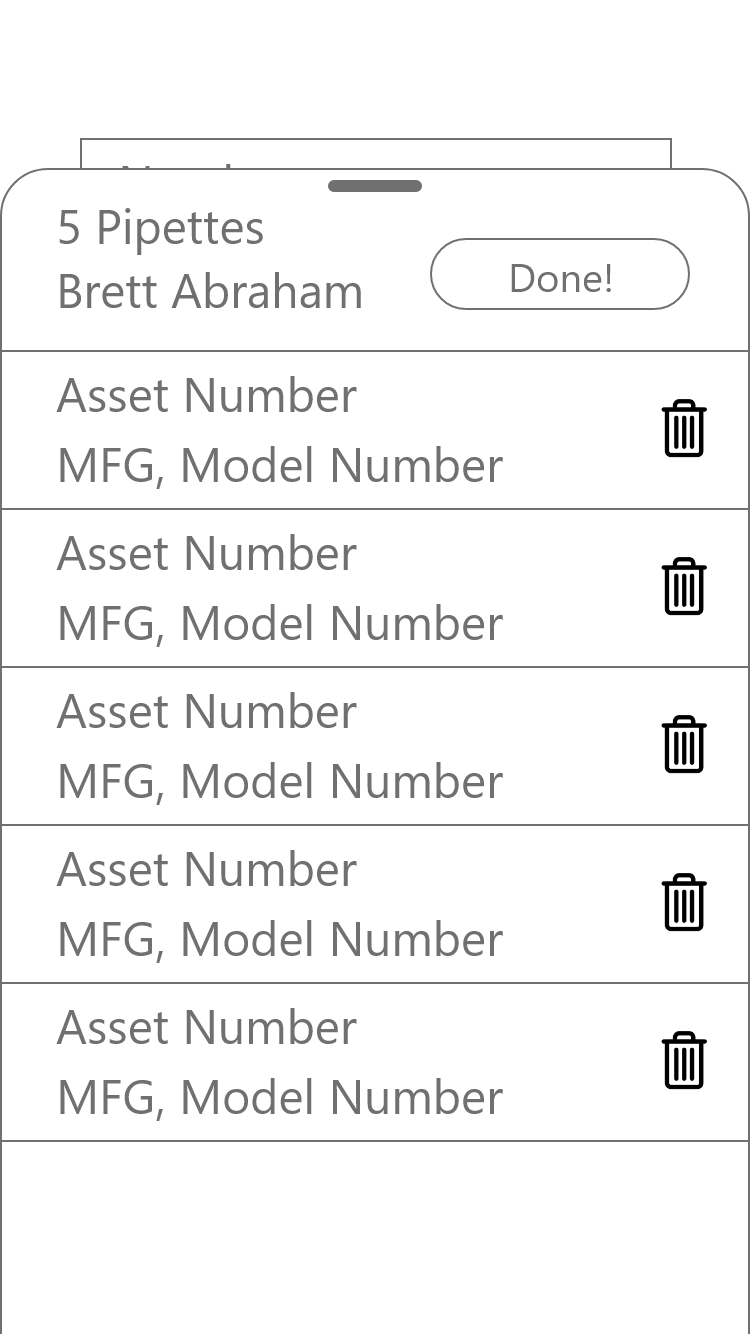
- An animation that visually showed pipettes being added to the tray
Improving UX
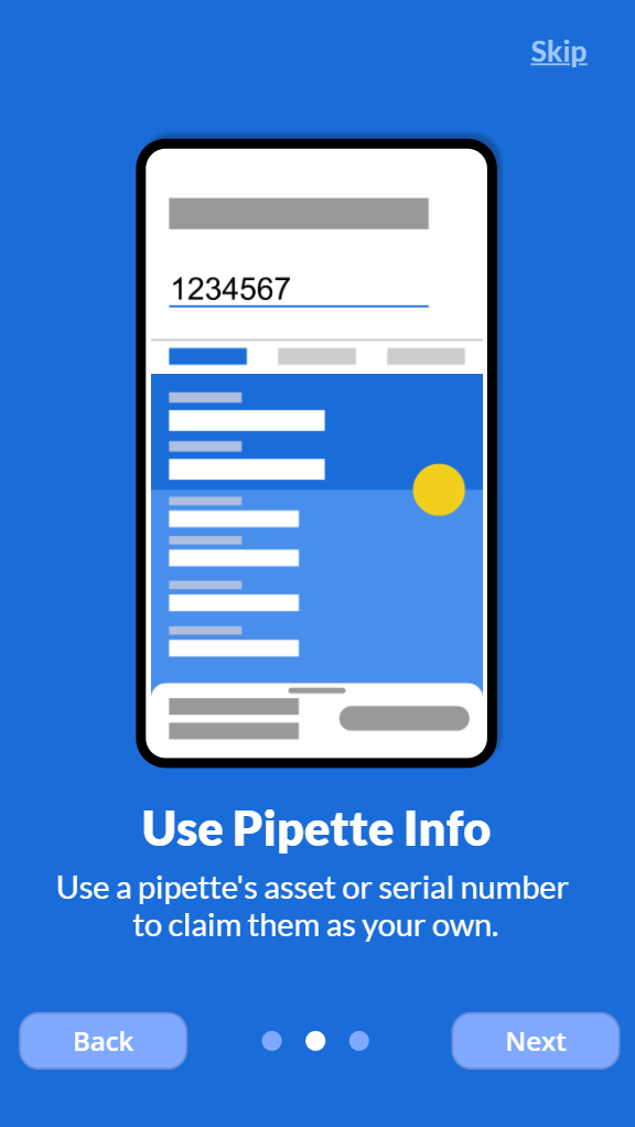
The final major necessity was creating an onboarding experience. I determined 3 key points I needed to get across to properly introduce the app:
- What Does This Do? It connects owners to pipettes in our database.
- Why Should I Care? Proper contact info means no surprise calibrations.
- How Do I Use It? I explained the basics of the app, along with what to do if the user is lacking some of the information. I also created a simple gif animation using Adobe Animate to better show how it works.
I created a few skippable pages to communicate each of these points. Points 1 and 2 were merged into the first page, while point 3 required 2 pages on its own.



Final UX Improvements
Allow Users to Edit Contact Info
I had previously set up the app to pull the user's name and email automatically. However, I also wanted to allow others to change that info, in case they wanted to use a different email or were inputting for someone else.
I added a simple "Edit" button next to the name, in which a modal popup would allow them to do so.
Add a Help Menu
There were a few questions that I anticipated and was sure there would be some I didn't.
For this, I added a Help Page. It included FAQs, my contact info, and the ability to review onboarding if desired.
Conduct a Final Round of Testing
With everything in place, I did one final round of testing to clean it up. I met with 4 participants in person, 2 of which had yet to see the app.
The key finding: the new animation worked!
The key finding: the new animation worked! Testers now understood what was happening and how it connected to the bottom tray.
I also found a few minor bugs and other improvements to make. After clearing those up, the app was set for launch!
Results
I completed the project in just under a month. I shared the app with researchers in a few meetings over the following weeks.
Before the App
Before this app was completed, my team and I had spent 2 weeks manually collecting data via email. During that time, we gathered data for roughly 5% of the total inventory.
Before this app released, we found that nearly half of the data we had collected was inaccurate and required us to start the process again.
After the App
In the 6 weeks after the app released, our data coverage jumped from less than 5% to over 95% of the inventory.
In the 6 weeks after the app released, our data coverage jumped from less than 5% to over 95%.
We had a handful of duplicates or inaccuracies, but they were much easier to sort out with such a large portion of the inventory covered.
In the following 12 months while I was in the position, we received 0 comments or complaints about inaccurate data.
We also found the tool useful for researcher transition. New researchers could easily use the app to update us on who owns which pipettes.
Learnings
The Final 10% Was the Most Challenging
This app was feature-complete in a matter of days. The remainder of time was focused heavily on testing, user experience, and an attractive interface.
Regular Testing Was Vital to Success
Over the course of the month, I conducted 3 rounds of tests. Testing early allowed me to pivot quickly and later tests helped ensure I was on the right track. The final test gave me the confidence to truly say that we were ready for release.
PowerApps Is Great for Quick Builds
PowerApps is a very useful tool for a quick and easy build that you can get out in a few days.
PowerApps Is Not Great for Complex Builds
Much of my time was spent building workarounds to create the result I actually wanted. While the solutions worked, the amount of time and effort required discouraged me from spending that time on similar improvements.
If I were creating a web app that needed an attractive interface and quality user experience, I would need to turn elsewhere. A few months after completing this, I began learning Python and Django.
Appreciation
A huge thanks to the team involved in this process.
In particular, I'd like to thank Megan Treu, who worked tirelessly to collect and verify most of this data from the start and took on extra responsibilities to allow me to finish this app.
I'd also like to thank Peter Truong and Mikayla Jacobs, who provided vital insights and regular testing to greatly improve the project.
